Visualization in Galaxy
Trackster is Galaxy's visualization and visual analysis environment. It lets you visualize your SAM/BAM, BED, GFF/GTF, WIG, bigWig, bigBed, bedGraph, and VCF datasets from within Galaxy. Trackster is enabled on our main and test instances, but not by default on local instances. If you are running a local instance and would like to use Trackster, please refer to the Setup Instructions below.
Why Trackster?
- Fast, interactive visualization for large, NGS/HTS datasets using only a Web browser. (Trackster works in Firefox, Chrome, Safari, and IE9+.)
- Galaxy integration: visualize any Galaxy dataset easily without downloading or sending it to a remote server.
- Powerful visual analysis features, including embedded tools for parameter exploration and dynamic filters for understanding annotated data.
- Custom compositing of tracks to create a single visual element with many datasets.
Getting Started
- Click on Visualization --> New Track Browser in the top menu bar.
- Choose a build and name for the visualization. Is the build you want not listed? Add your own custom build (instructions in a section below).
- You will now see a visualization with no datasets in it. Add datasets by clicking the "Add Datasets to Visualization" button. Select a history or data library, followed by one or more datasets. If your desired datasets do not show up, make sure they are of the same build as the visualization and that they are of a supported dataset type.
- After adding tracks, Trackster will index the datasets for fast access. Once this is done, you can navigate to a chrom/contig in the dropdown to view your data.
Navigation
Viewing a specific location
- Click the text showing the current region. A select box will show up in place.
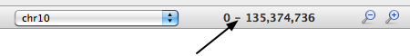
- Enter the desired region with the format: chrom: start-end. The first part (chrom/contig) is required, but the start/end is optional, so you could enter chr1: 1-20000, or simply chr1. Then press Enter.

Mouse Navigation
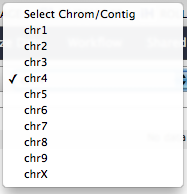
- You can use the mouse to change chroms/contigs using the dropdown.
- Dragging anywhere in the main window will pan the view.
- Double clicking anywhere in the main window will zoom in at the location of the mouse click.
- There are zoom-in and zoom-out icons on the toolbar.
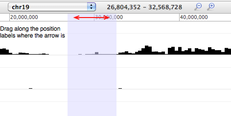
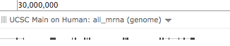
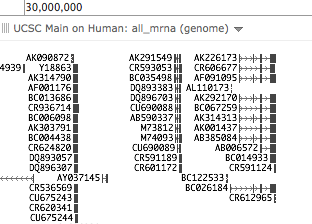
- You can drag a region within the location track to view that region, as shown in the following image:
Keyboard Navigation
You can use the arrow keys on your keyboard to pan the view.
Display
Trackster has two fundamentally different types of track classes: LineTracks and FeatureTracks. The former is used for wig, bigWig, and bigBed datatypes, while the latter is used for the others.
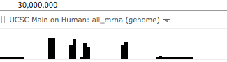
LineTrack
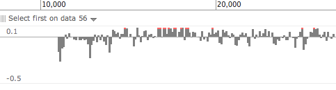
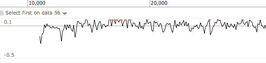
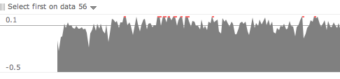
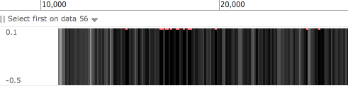
LineTracks are used to display quantitative data along a y-axis. There is a thin gray line that represent 0. GTB has four different drawing mode for LineTracks:
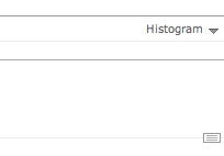
Histogram: fill region between x-axis and the data point. Red region indicates overflow beyond the listed maximum/minimum value.
Line: connect the data points with a line. Red dot indicates overflow beyond the listed maximum/minimum value.
Filled: fill region from the bottom of the track to the data point.
Intensity: show the data point as a gradient of the current y-axis range (darker is more).
To change between these display modes, click the dropdown at the top-right of the track.
FeatureTrack
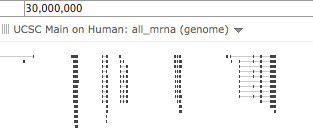
FeatureTracks display feature interval data, like BED, BAM, GFF, GTF, and VCF. Like LineTracks, it also has different types of displays. By default, the GTB automatically chooses the display it deems most suitable for the current level of detail, but this can be overridden via the selection box on the top-right corner of the track. The following diagrams are all of the same data.
Automatic: Trackster chooses the level of detail based on how much data is on the screen. Currently shows feature spans without any exon detail or labels because there is a lot of data in this region.
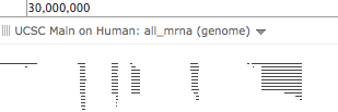
Histogram: Show the number of features in binned regions.
Dense: draw everything stacked on top each other, in one slot. Useful to see coverage while minimizing screen real estate.
Squish: draw exons but not strand/labels
Pack: draw exons, strand, and labels
To change between these display modes, click the dropdown at the top-right of the track.
Custom Builds
GTB lets you build track browsers for builds that aren't already installed for all users (see the next section on how to do this). You can specify custom builds on a user-by-user basis by navigating to User --> Custom Builds. There you can manage your custom builds or add new ones. For example, let's say you want to add a custom bear genome:
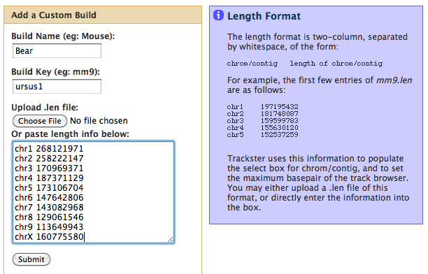
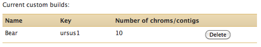
The chrom/contig length information can either be typed in or pasted directly into the box as shown, or submitted by selecting a file containing the information. Successful submission will result in the build being listed:
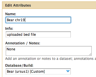
You can then set datasets to use our new custom build:
And finally, you can create a new track browser of the new build:
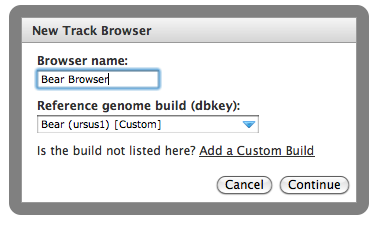
The new browser will use the chrom/contig information we specified for it.
Setup for Local Instances
See Visualization Setup for instructions about how to set up your local instance for visualization.
Implementation Details
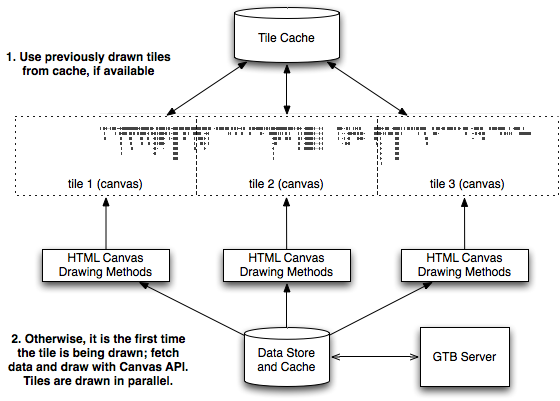
Trackster is designed in a modular client/server fashion using AJAX calls that return JSON data. The client is fully written in Javascript and utilizes the HTML5 canvas element, which exposes a low-level drawing API, to draw data.
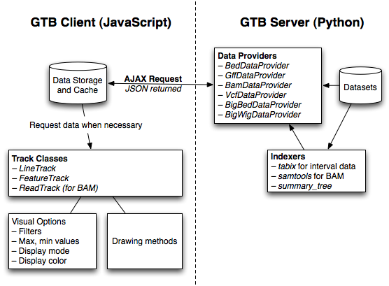
Each track consists of one or more canvas tiles, which are drawn and processed in parallel.